Building an Interactive 3D CSS Cube
I’ve been experimenting with CSS animations and wanted to build something interactive. After seeing some impressive examples online, I decided to create a 3D rotating cube with full user control. Also set it up on its own subdomain to learn the deployment process.
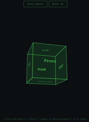
The result: cube.kahdev.me
The Goal
Create an interactive 3D cube that users can:
- Click and drag to rotate in any direction
- Pause and resume auto-rotation
- Reset to the starting position
- Control via keyboard shortcuts
And host it on a subdomain using GitHub Pages.
Technical Things to Learn
CSS 3D Transforms
The cube uses CSS 3D transforms to create the illusion of depth. The key property is transform-style: preserve-3d, which tells the browser to maintain the 3D positioning of child elements in 3D space rather than flattening them.
Each face of the cube is positioned using a combination of rotation and translation:
.cube {
    transform-style: preserve-3d;
}

.front  { transform: rotateY(0deg) translateZ(100px); }
.back   { transform: rotateY(180deg) translateZ(100px); }
.right  { transform: rotateY(90deg) translateZ(100px); }
.left   { transform: rotateY(-90deg) translateZ(100px); }
.top    { transform: rotateX(90deg) translateZ(100px); }
.bottom { transform: rotateX(-90deg) translateZ(100px); }
The translateZ(100px) pushes each face outward from the center by half the cube’s width, creating the 3D structure.
JavaScript Animation with requestAnimationFrame
Initially, I tried using CSS animations for the auto-rotation, but I ran into a problem: CSS animations reset when you toggle classes, making it impossible to smoothly pause and resume from the current position.
The solution was requestAnimationFrame, which gives frame-by-frame control:
function autoRotate() {
    if (isAutoRotating) {
        rotationX += 0.3;
        rotationY += 0.3;
        updateCubeRotation();
        animationId = requestAnimationFrame(autoRotate);
    }
}
This approach runs at 60fps and allows pausing/resuming without resetting the rotation values. When you pause, the exact rotationX and rotationY values are preserved, and resuming simply continues incrementing from those values.
Mouse and Touch Event Handling
Making the cube draggable required tracking mouse movement and converting it to rotation:
document.addEventListener('mousemove', (e) => {
    if (!isDragging) return;

    const deltaX = e.clientX - previousMouseX;
    const deltaY = e.clientY - previousMouseY;

    rotationY += deltaX * 0.5;  // Horizontal movement rotates around Y axis
    rotationX -= deltaY * 0.5;  // Vertical movement rotates around X axis

    updateCubeRotation();

    previousMouseX = e.clientX;
    previousMouseY = e.clientY;
});
The 0.5 multiplier controls sensitivity, how much the cube rotates relative to mouse movement.
Touch events work similarly but use e.touches[0] instead of direct mouse coordinates:
const touch = e.touches[0];
const deltaX = touch.clientX - previousMouseX;
const deltaY = touch.clientY - previousMouseY;
Perspective
The perspective property on the container creates the vanishing point for the 3D effect:
.container {
    perspective: 1000px;
}
The value (1000px) determines how “strong” the 3D effect is. Lower values create more extreme perspective, higher values create a more subtle effect.
Challenges
Pause/Resume Behavior
Getting the pause/resume to work correctly was the biggest challenge. The cube needed to:
- Freeze at its exact current position when paused
- Continue from that exact position when resumed
- Not reset or jump to a different angle
This required switching from CSS animations to JavaScript’s requestAnimationFrame and carefully managing the rotation state.
Creating an Optimized GIF
Getting a good demo GIF for the README was a learning experience. I used macOS’s built-in screen recording (Command + Shift + 5), then processed it with FFmpeg:
# Generate custom color palette
ffmpeg -i input.mov -vf "crop=1100:1500:(iw-ow)/2:10,fps=10,scale=300:-1:flags=lanczos,palettegen" palette.png

# Create GIF using the palette
ffmpeg -i input.mov -i palette.png -filter_complex "crop=1100:1500:(iw-ow)/2:10,fps=10,scale=300:-1:flags=lanczos[x];[x][1:v]paletteuse" output.gif

# Optimize further
gifsicle -O3 --colors 128 output.gif -o small_cube.gif
The crop filter removed unwanted screen borders and gifsicle reduced the file size.
Subdomain Setup
Setting up cube.kahdev.me:
- Creating CNAME records in Cloudflare DNS
- Configuring GitHub Pages custom domains
- More
CNAMEfiles - More Waiting for DNS propagation and SSL certificate provisioning
What I Learned
CSS 3D transforms are powerful and hard. With just rotateX(), rotateY(), translateZ(), and transform-style: preserve-3d, you can create complex 3D effects without any libraries. Takes time learning 3D.
requestAnimationFrame is important for smooth animations. It syncs with the browser’s repaint cycle, and gives you frame-by-frame control.
State management matters. Keeping track of rotation values, animation state, and user interaction required careful thought about when to update what.
LLMs are excellent learning aids. Used Claude to understand CSS transforms, debug event handling, and going through the GIF creation process.
CLI tools rather than websites. FFmpeg’s powerful and you don’t have to upload to another server on the web.
The Result
An interactive 3D cube that works on desktop and mobile. The whole project took several hours of experimentation and breaking things to get right.
Live demo: cube.kahdev.me
Source code: github.com/khesse-757/cube
Next Steps
- Add color changing faces
- Implement physics/momentum when spinning the cube
- Create other 3D shapes (pyramid, sphere, soccer ball)
- Add texture mapping to faces
This was fun. Got to dive into CSS, JavaScript, and deployment workflows. On to the next experiment.